
Case Study: The Summit - Turks & Caicos Villas
A conversion-focused landing page for an ultra-luxury villa development, built to carry marketing traffic through to qualified enquiries.
Delivered independently as a freelance project Hire Me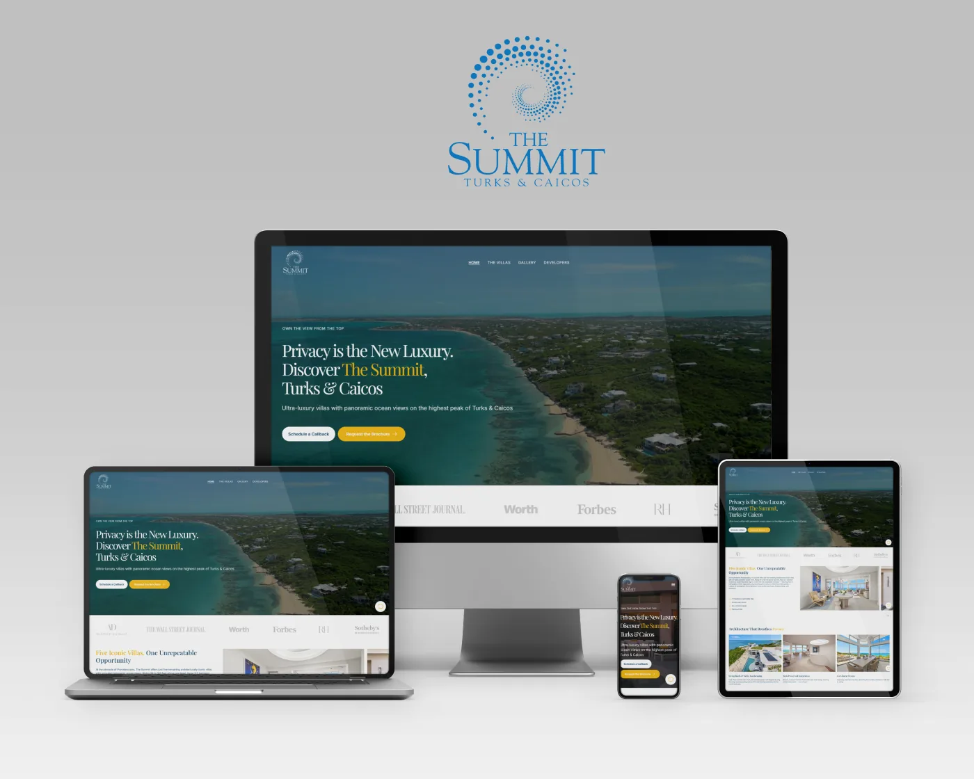
The Summit is a five-villa development on the highest point of Providenciales, Turks & Caicos, with residences starting at $3M. The brief was a conversion-optimized landing page to sit behind marketing campaigns: one long-form page that establishes credibility, tells the architectural story, and routes every visitor toward requesting the brochure or scheduling a callback.
What the page had to do
- Open with a full-bleed hero that sells the location immediately, with both primary calls to action visible before any scrolling.
- Build trust quickly through press placements and partner marks, and through profiles of the developer and the architect behind the project.
- Present the property in depth: architecture and sustainability features, a tabbed section covering views, safety, utilities and floorplans, and image carousels throughout.
- Make the case for the location itself, with a feature row on financial privacy, tax, access, residency and climate.
- Close on a brochure request form capturing name, email, phone and preferred contact time, feeding the sales team directly.
- Hold up on every screen size, since a large share of campaign traffic arrives on mobile.
My contribution
I handled the front-end build: translating the design into a responsive production page, implementing the interactive pieces (image carousels, the tabbed property section, and the brochure form with its validation), wiring up the calls to action, and tuning the page for performance and SEO. Large photography carries a site like this, so a good deal of the work went into keeping the imagery sharp while keeping the page quick to load.
The Challenge
Two things pulled against each other on this build:
- Weight versus speed: the page is built almost entirely out of full-width photography and a hero that fills the viewport, which is exactly what a landing page for paid traffic cannot afford to be slow at. Image sizing, formats and lazy loading did the heavy lifting here.
- Long page, one goal: someone weighing a multi-million-dollar purchase reads a lot before acting, so the page is long by necessity. Keeping the conversion path present throughout, without breaking the calm, editorial tone of the design, drove most of the layout decisions.
The Results
The result is a single campaign-ready page that carries a visitor from a paid click through the full story of the development and into a brochure request or a callback, with the same experience on desktop, tablet and phone. It gives the sales team one destination to point every channel at, and a lead form that hands them a qualified enquiry along with a preferred time to call.
This page describes my front-end contribution to the project and covers only publicly visible functionality. Product names and trademarks belong to their respective owners.