
Case Study: Smile & Care - Dental Clinic
A marketing site for a cosmetic dentistry clinic, built to turn search and ad traffic into booked consultations.
Delivered independently as a freelance project Hire Me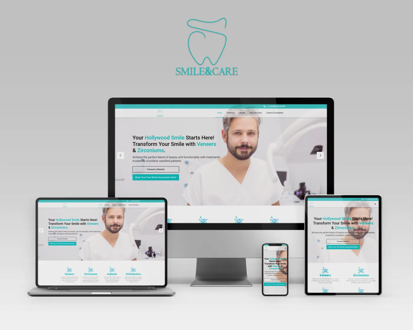
Smile & Care is a clinic built around cosmetic dentistry: veneers, zirconium crowns, implants and orthodontics. Patients arrive from search and paid campaigns knowing what they want their smile to look like, but rarely knowing which treatment gets them there. The site had to close that gap quickly and end in one of two actions - booking a free smile assessment, or calling the clinic.
What the site had to do
- Lead with a rotating hero that pairs each headline treatment with its own message, and keeps both calls to action - "Consult a Dentist" and "Book Your Free Smile Assessment" - above the fold.
- Explain the four core treatments in plain language on the home page, so a visitor who has never heard the word "zirconium" still knows which section is meant for them.
- Give each treatment its own page with room for detail, since a decision at this price point is rarely made on a single visit.
- Show results. Cosmetic dentistry is bought with the eyes, so before-and-after work needed a dedicated, well-presented section rather than a stray gallery.
- Build trust in a medical context through the clinic and team pages, keeping the tone measured rather than making claims a clinic should not make.
- Keep the phone number reachable at all times in a persistent top bar, tap-to-call on mobile, because a good share of patients would rather ring than fill in a form.
- Work properly on phones, where most of the campaign traffic lands.
My contribution
I took the project from design through to a live site: the visual identity applied across the pages, the layout system for the treatment and results sections, and the front-end build. That included the hero slider, the treatment cards, the consultation form and its validation, the tap-to-call behaviour, and the responsive work across desktop, laptop, tablet and phone. Page speed and on-page SEO were part of the brief rather than an afterthought, since the site sits behind paid traffic.
The Challenge
Marketing a medical service has constraints an ordinary landing page does not:
- Persuasion without overpromising: the site has to be convincing while staying honest about outcomes. The persuasion had to come from the photography, the results section and the clarity of the layout, not from the copy making guarantees.
- Explaining unfamiliar treatments: most visitors search for a result, not a procedure. Every treatment needed a one-line description a non-specialist actually understands, sitting above the clinical detail rather than behind it.
- Two conversion paths, not one: the form and the phone had to be treated as equally important. Designing around a single CTA would have quietly lost the patients who only ever call.
- Image-heavy on mobile: clinical photography and before-and-after pairs carry the site, and they had to stay sharp without making the phone experience slow.
The Results
The clinic ended up with one destination it can point every channel at: a site that takes a visitor from a general interest in cosmetic dentistry, through the treatment that fits them and the results the clinic has produced, to a booked assessment or a phone call - and does it the same way on a phone as on a desktop.
This page describes my contribution to the project and covers only publicly visible functionality. Product names and trademarks belong to their respective owners.